
Stage Images
To display your own image (stage images) on the landing page of your event platform, proceed as follows:
1. In the menu on the left, select Event Website Builder -> Branding.
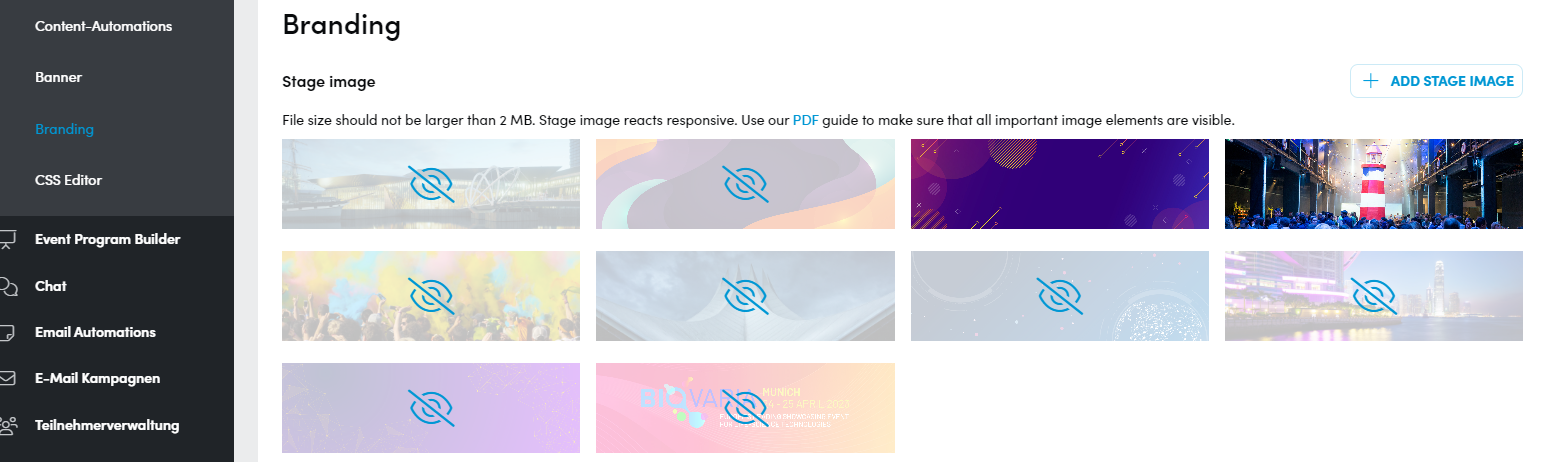
2. Click + add stage image on the upper right. This opens the following window:
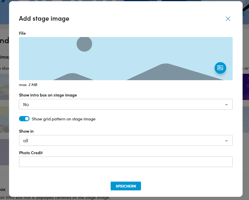
3. Use the round button on the right [+] to select an image to upload. Make sure that they do not exceed a size of 2 MB. You can find out what you should pay attention to with regard to the dimensions of the images here: Converve Image Sizes
4. In the Show intro box on stage image field, you can set whether and which intro box should appear on the stage image. You can find out how to edit the intro boxes here: Intro Boxes
5. The Show grid pattern on stage image button can be used to place a grid on the stage image. This is useful if you want to display a text on the image using the intro box, as this will be more visible depending on the color of the image.
6. The Show in field defines on which landing pages the stage image should be used.
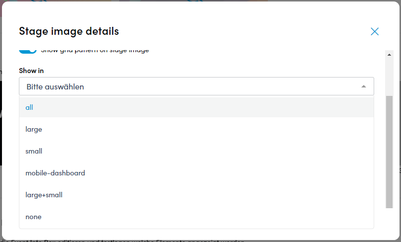
You can choose between the following options:
- all – Show Stage Image on all stages
- large – Show Stage Image only on large stages
- small – Show Stage Image only on small stages
- mobile-dashboard – Show Stage Image on the mobil version of the platform
- large+small – Show Stage Image on the small and the large stage
- none – Die Stages Images werden nicht angezeigt
You can find out how to create pages with different stages here: Page Builder
7. In the Photo Credit field, you can enter a copyright notice which will then be displayed at the top right of the uploaded image. This is optional.
8. Click on save to apply your changes.
9. You can upload as many stage images as you like. These are displayed on a rotating basis or can be used on different stages. (see above)
Event Info Box
The Event Info Box is displayed on the start page of your event platform and provides helpful information about the event at a glance.
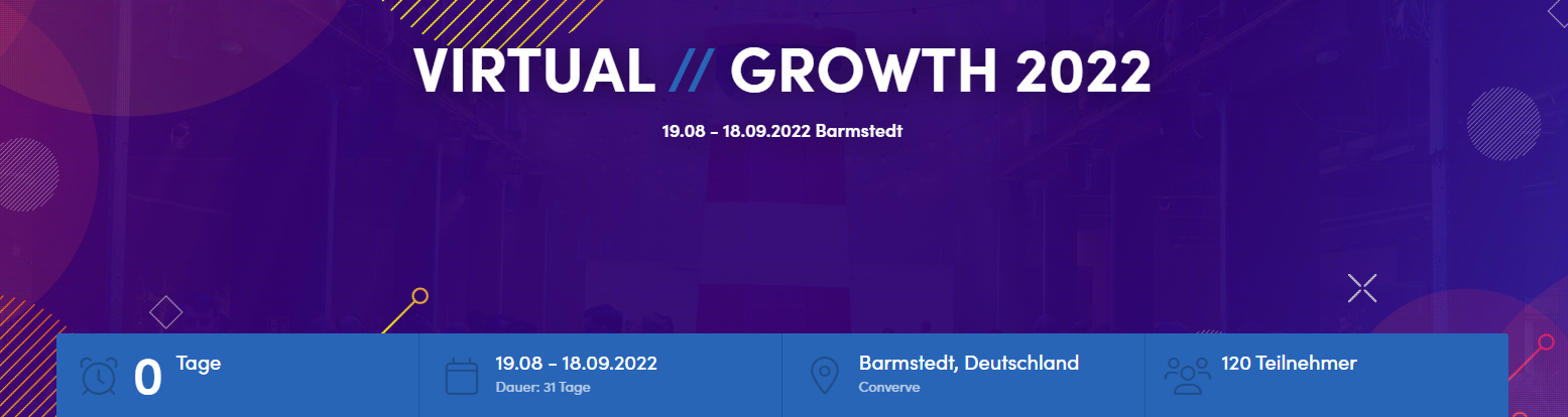
This is how you edit the Event Info Box:
1. In the menu on the left under Event Website Builder, click on the sub-item Branding. The third item on the page that now opens is the settings for the Event Info Box:

2. Click the button Edit Info Box; to open the following window:
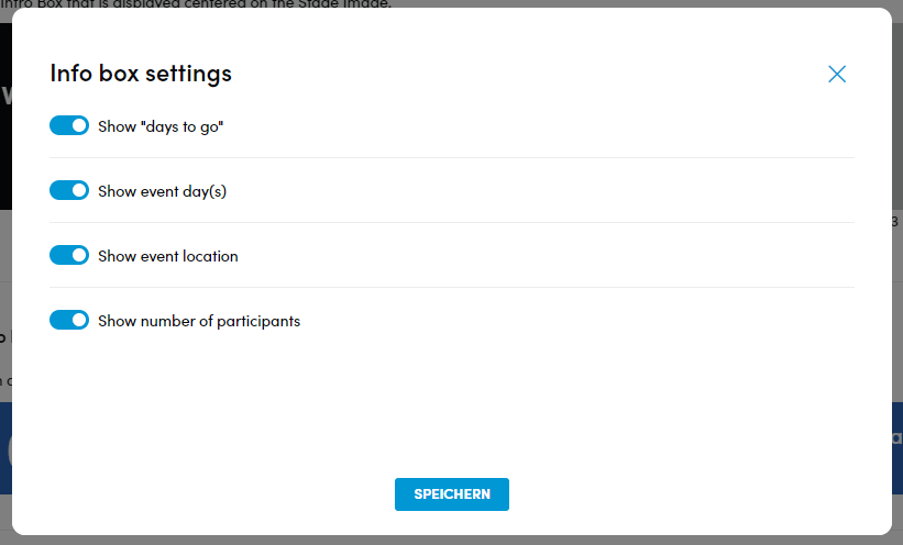
3. Use the four buttons to select the elements you would like to display in your Event Info Box:
- Show “days to go” – Display of the remaining days until the event
- Show event day(s) – Display of the date of the event and the duration in days
- Show event location – Display of the event location
- Show number of participants – Display of the number of participants
4. Once you have made your selection, click on the “Save” button. The selected information is now displayed in the Event Info Box.
Intro Box
Intro boxes are used to display texts in the middle of the stage images. If the basic event data such as event name, date and venue are already set in the platform, an intro box is automatically generated with this data in HTML. In addition, a Register now! button appears in the intro box if you are not logged in. This links to the registration page.
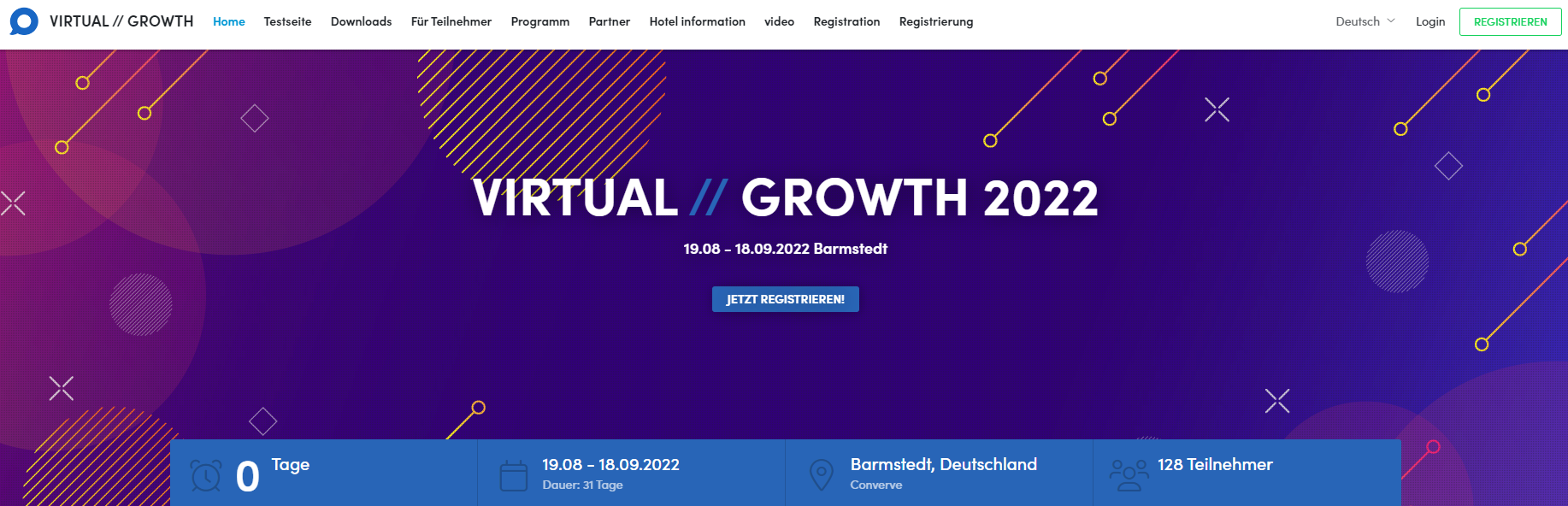
1. Click on the sub-item Branding in the menu on the left under Event Website Builder.
2. The second item on the page that now opens is Intro Box.
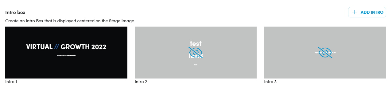
3. To activate or deactivate an Intro Box, move the mouse pointer over the respective Intro Box so that a pencil symbol appears at the top right of the image.
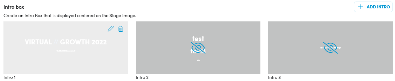
4. Click on the pencil icon to open the editing page:
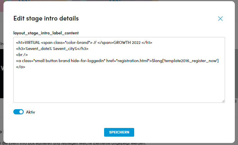
5. You can now activate or deactivate the Intro Box using the Active switch.
6. Once you have made your settings, click on save to apply them
Please Note: It is possible to change the content of the Intro Box and remove the registration button, for example. We will be happy to help you with this, please contact us. If you have knowledge of HTML, you are welcome to make changes yourself.
Platform Icon
To design your event platform according to your corporate design, you have the option of inserting an icon, for example your logo. This will be displayed in the browser tab and in the platform header.
1. In the menu on the left under Event Website Builder, click on Branding.
2. In the fourth position on the page that now opens, you will find Platform Icon:

3. Please make sure that the desired icon is in png format and does not exceed 8 MB in size. It should also preferably be square to ensure the best possible display. If the icon contains text, this should be as large as possible in order to remain legible.
4. Click on Change icon on the right to open the following window:
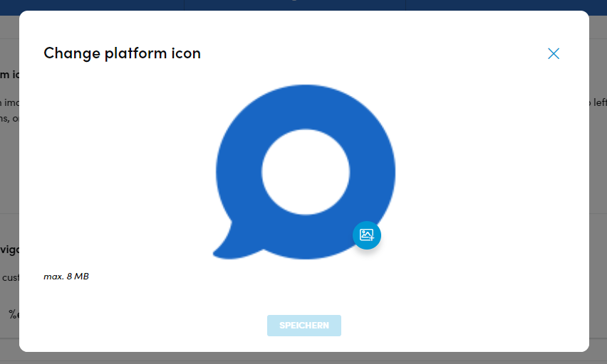
5. You can now upload a new image as an icon using the button in the right corner of the existing icon.
6. Click on save to complete the upload.
Please Note: In order for the new icon to be displayed, you may need to perform a “hard refresh”.
To do this, press “ctrl” + “F5” [Windows] or “cmd” + “R” [Mac] on the keyboard.
The Top Navigation Bar, displays the same information in the website header that is in the Event Info Box. You can find out how to edit the Event Info Box further up in this article.
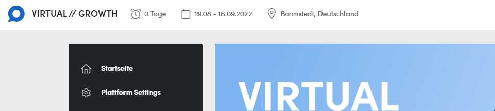
To edit the Top Navigation Bar, proceed as follows:
1. In the menu on the left under Event Website Builder, click on the sub-item Branding.
2. In the fifth position on the page that now opens, you will find the item Top Navigation Bar:

3. Click the Button Edit Navigation Bar to open the following pop up.
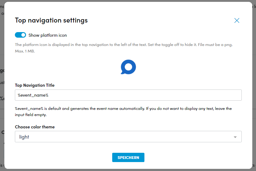
4. You can use the Show platform icon button to hide or display the platform icon. You can find out how to insert a platform icon further up in this article.
5. The Top Navigation Title field automatically displays the event name generated from the event settings by default. You can overwrite the content of this field.
6. You can use the Choose color theme field to set the color mode of the platform header and choose between light and dark.
7. Click on save to apply your settings.
Plattform Colors
You can design the color scheme of your platform as follows:
1. Click on the sub-item Branding in the menu on the left under Event Website Builder.
2. At the penultimate position on the page that now opens, you will find the Platform Colors item.

The Action Color amongst other things is used for buttons or links while Highlight Color provides colorful accents.
3. Click edit color to change them in the following pop up:
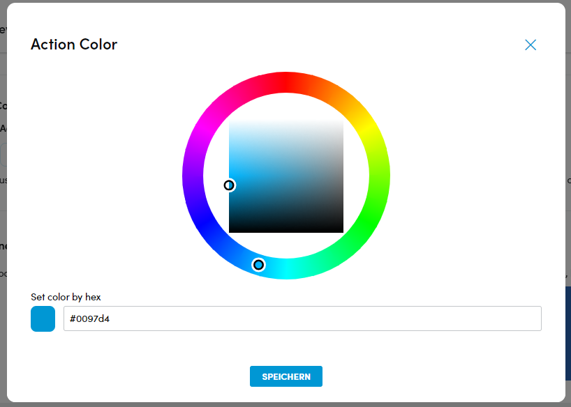
4. You have two options for setting the desired color:
a) Insert a color code in the Set color by hex field if you already have one.
b) Use the outer ring to select the color direction and specify the desired hue in the inner square.
5) Click on save to apply your settings.
Note: Here you will find a calculator with which you can convert color codes to HEX: Convert colors and color values 🎨 RGB, HEX, CMYK, HSL (farben-umrechnen.de)
Please note: Here you will find a calculator with which you can convert color codes to HEX: Convert colors and color values
E-Mail Banner
The event name, event date and event location are automatically displayed in the email banner. However, you have the option of inserting an image or customizing the text instead.
1. In the menu on the right click on Event Website Builder and then on the sub-item Branding.
2. Towards the bottom of the page you will find Email banner.

3. Make sure that the desired image does not exceed a size of 1 MB and is a maximum of 600 pixels wide (exactly 600 pixels is ideal), the height is variable.
4. Click change email banner on the right, this will open a pop up window:
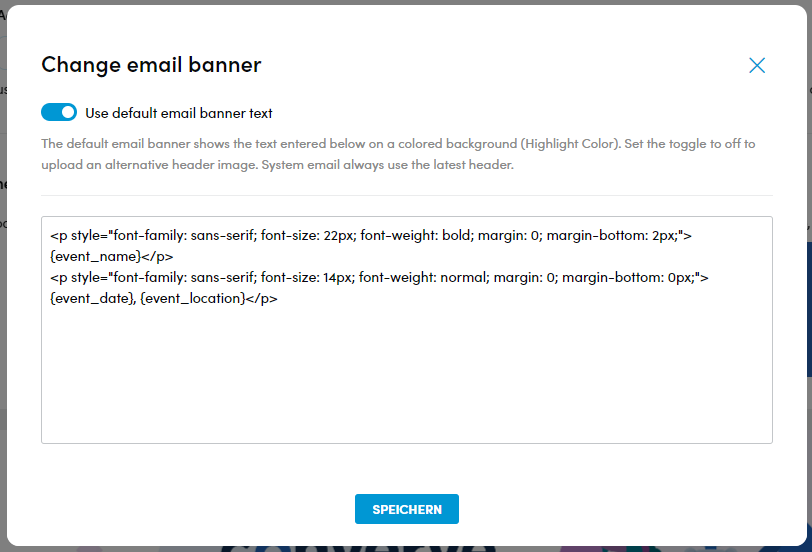
5. Deactivate the slider at the top left. The input field then disappears.
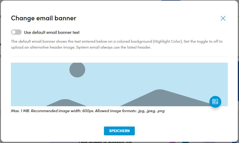
6. You can select and upload an image using the symbol at the bottom right of the screen [+].
7. Click on save, to apply your changes.
Please note: You can also add a customized text to the email banner. HTML knowledge is an advantage for this. Please contact us if you need support with this.
Converve Images Sizes
To ensure that the images you wish to upload are displayed optimally on the platform, we have compiled an overview of the sizes to be observed.
If no height is specified, this is flexible.
Large Stage
[Total]Width:1920 Pixel Hight=540 Pixel
[Always visible area]Width=740 Pixel Hight=400 Pixel
Small Stage
[Total]Width:1920px Hight=340 px
[Always visible area]
Width=740px Hight=400 px
You can find more information about stage images above.
Sponsor-Banners
LargeBanner (above and below the content area): Width=969 px
Small Banner (below the user menu): Width=262 px
You can find out more about banners here.
Images in Dashboxen
Ideal Width=430 px
Company-/Productprofile Titelimages:
Width=945px Max. Hight=370 px
E-Mail-Header
Width=600 px
You can find more information about e-mail banners above